Offscript
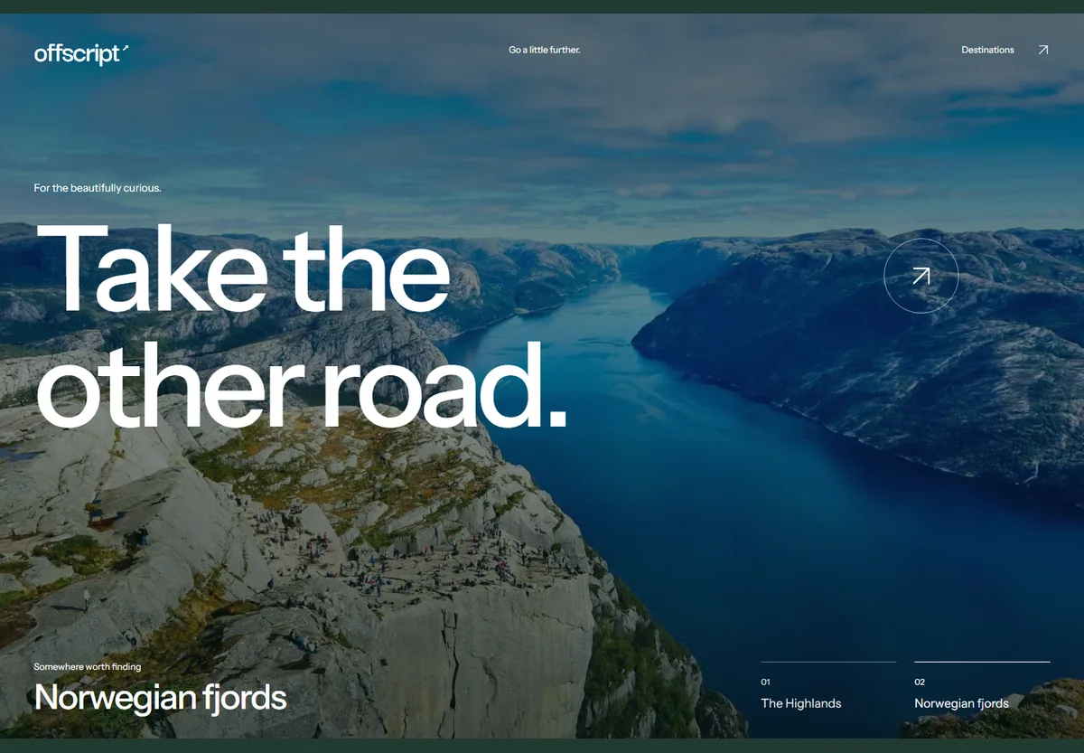
A travel website concept for people who choose a place by its atmosphere, not a star rating. Two destinations, two stories.
Open the working demo
The challenge
A catalogue compares prices well, but rarely tells you why a place is worth visiting. We wanted to explore whether one distinctive image and a short story could guide that first decision.
The design decision
Instead of a carousel of offers: two destinations and a visible selector. The photograph, heading and story change together. Text has its own dark layer so readability never depends on the photograph.
Try it yourself
Switch between Scotland and the Norwegian fjords. See the landscape and story change. This is a local demo, without booking, payments or invented availability.
Scope & limitations
We check repeated clicks, text contrast, keyboard operation and reduced motion. We report no sales results: this project had no commercial client.
Before production
A further stage would need a real offer, availability, booking terms and integration with an operator’s system.
The interface responds.
The Norwegian fjords replace the Scottish scene. The selected destination updates the photograph, title and route together.