Form & Field
How can architecture be shown without trapping it in a grid of thumbnails? This original concept starts with proportion, material and one considered image.
Open the working demo
The challenge
Visitors to an architecture portfolio have two different goals: get a feel for the work or quickly find a type of project. A dense thumbnail grid speeds up browsing but flattens the first impression.
The design decision
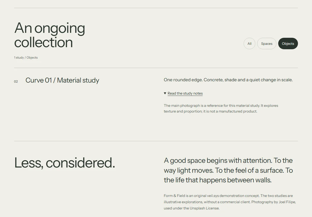
We separated those needs. The opening gives photography scale. The collection below offers project filters, while a study opens extra context without losing your place.
Try it yourself
Try a collection filter. Pick a category and open a project study. Building names and descriptions are fictional; photography is licensed stock.
Scope & limitations
We check category changes, keyboard access and the return to the full collection. This is a frontend prototype. We have not conducted client research or measured conversion.
Before production
For a real launch: studio photography, a CMS content model, real project descriptions, responsive images and editable collections.
The interface responds.
The Objects filter narrows the collection. Opening a study adds material and project context within the same view.